Footprint Chart Patterns Cheat Sheet for Order Flow
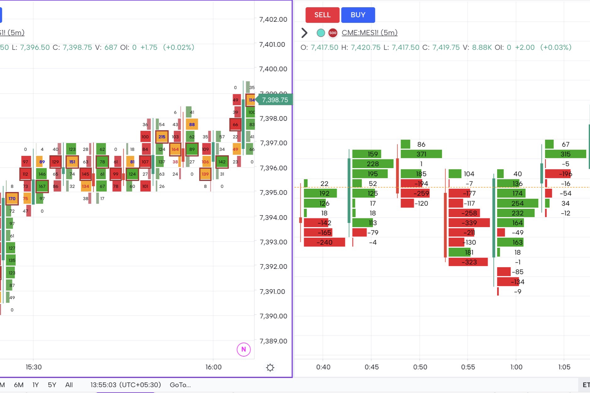
A footprint chart shows you the inside of every candle — bid volume on one side, ask volume on the other, totals at every price. The numbers are not the point; the patterns are. Once you have seen the same shapes appear at the same kinds of locations a few hundred times, footprint reading stops feeling like decoding and starts feeling like reading. This cheat sheet covers the eight footprint patterns that show up most often, what each one means, and what to do when you see one.
If you are new to the format itself, start with the complete footprint trading guide and circle back. If you already know how to read a bid-ask cluster, you are in the right place.
Quick Refresher: How a Footprint Bar Is Built
Every footprint bar is a normal price bar with the inside filled in. At each price the candle traded, two numbers appear: contracts that lifted the offer (aggressive buys, traded at the ask) and contracts that hit the bid (aggressive sells, traded at the bid). Most platforms colour-code high-imbalance prices — strong buying in green, strong selling in red — and highlight the price with the largest total volume in the bar.
That is all the data you need. Every pattern below is just a shape made by those numbers, repeating in ways the market repeats.
Pattern 1: Stacked Imbalances
What it looks like. Three or more consecutive prices in the same bar showing a heavy imbalance in the same direction — for example, ask volume 3x or 4x the bid volume across four price levels stacked on top of each other.
What it means. Aggressive participants are lifting offers (or hitting bids) so quickly that the other side cannot keep up. This is one of the cleanest signs of one-directional intent inside a bar. When stacked imbalances form away from a key level, they are usually continuation. When they form right at a level — at the previous day’s high, at a naked POC, at a value-area edge — they often mark the failed defence and a clean breakout.
How to trade it. Use stacked imbalances as confirmation of bias, not as standalone entries. The pattern says “this side is in control”; price action and the level it forms at tell you what to do about it.
Pattern 2: Absorption
What it looks like. Heavy one-sided volume hits a price level, and price refuses to move. You see a fat number — say 500 contracts traded at the ask in a single price row — and the next bar opens at the same price or lower, not higher.
What it means. A passive participant is sitting on the offer (or the bid) absorbing everything thrown at them. Retail aggression keeps trying; institutional liquidity keeps eating. Absorption is one of the highest-conviction reversal signals on a footprint chart because it tells you a serious player has decided this level matters.
How to trade it. Take absorption only at levels that have a reason to matter — value-area edges, prior swings, daily POCs. A fade into the level with a stop a few ticks beyond pays well when the absorption is real. A close beyond the level invalidates the read.
Pattern 3: Exhaustion
What it looks like. A trend bar where the very last price prints a much smaller imbalance than the bars before it, often with delta dropping sharply on the final tick. Volume is no longer expanding; the move is running on fumes.
What it means. The trend that pushed price to this point has run out of fresh aggressors. The remaining trades are late entries getting filled at the worst prices. This is not the same as absorption — there is no big player defending the level, just no more buyers (or sellers) in the queue.
How to trade it. Exhaustion alone is a warning, not a setup. Wait for confirmation — a reversal bar, a delta divergence on cumulative volume delta, or a clean close back inside the prior range. Then enter against the exhausted move with a tight stop.
Pattern 4: Unfinished Auctions (Poor Highs and Poor Lows)
What it looks like. A bar’s high or low closes with volume on both sides of the extreme price — there is no zero on either the bid or the ask side at the top tick. A “finished” auction prints a single number on one side at the extreme; an unfinished auction does not.
What it means. The auction at that price did not complete. There were still buyers willing to pay at the high (or sellers willing to sell at the low) when the bar ended, but the bar ran out of time. Markets tend to come back and finish unfinished auctions — the level acts as a magnet for future price action.
How to trade it. Mark unfinished highs and lows on your chart and watch for retests. The retest itself is the trade: usually a small fade if the structure has not changed, a breakout continuation if it has. Also Read: Auction Market Theory For Day Trading
Pattern 5: P-Shape and b-Shape Profiles
What it looks like. Inside a single bar (or a short cluster of bars), the footprint volume distribution forms a recognisable letter shape. A P-shape is heavy at the top, light at the bottom; a b-shape is heavy at the bottom, light at the top.
What it means. Distribution shape inside a bar tells you where the bar’s “value” sat. A P-shape after a downtrend is short-covering — the heavy volume is up high, where shorts are getting closed out. A b-shape after an uptrend is long liquidation — heavy volume down low, where longs are being stopped. Both are typically reversal-context bars, not trend-continuation bars.
How to trade it. P and b shapes are best read in context. A P at a daily low after a sell-off, with absorption confirmation, is one of the cleaner long entries on the chart. A b at a daily high after a rally is the same trade in reverse. Also Read: Volume Profile: The Ultimate Guide
Pattern 6: Delta Divergence
What it looks like. Price prints a new high (or new low) but the bar’s delta — buy volume minus sell volume — is smaller than the delta on the previous high (or low). The market is reaching the new extreme on weaker conviction.
What it means. The trend is becoming a one-side-only move. Each new high is being made with less aggressive buying than the one before; the structure is hollowing out. Divergence does not call the top — it tells you the fuel is running low.
How to trade it. Combine delta divergence with one of the other patterns above (absorption, exhaustion, unfinished auction). Two confluent signals at the same level is when the high-probability fade triggers. Also Read: Key Indicators for Order Flow Trading: Identifying Market Sentiment
Pattern 7: Iceberg Orders
What it looks like. Volume keeps printing at the same price level even though the displayed depth at that level is small or has been hit multiple times. Resting orders that should have been consumed are mysteriously still there.
What it means. A large participant has placed a hidden (“iceberg”) order — a small visible quantity backed by a much larger reserve. As the visible portion gets hit, the next slice replenishes from the reserve. Iceberg detection is the holy grail of footprint reading because it lets you piggyback on size that was never meant to be seen.
How to trade it. Trade with the iceberg — the side absorbing aggression is the side you want to be on. Stops go on the other side of the iceberg’s price. When the iceberg eventually gets cleared and price punches through, your trade is invalidated.
Pattern 8: Single Prints / Skip Bars
What it looks like. A price level inside the trading range with very low or zero volume — almost a gap, but inside the bar rather than between bars. The footprint shows numbers above and below but a thin or empty row in the middle.
What it means. Price moved through that level so fast that no real trading occurred there. Skip bars are imbalance candidates — the auction did not complete at that level, so the market typically returns to fill it in. They are the inside-the-bar version of unfinished auctions at the extreme.
How to trade it. Mark skip-bar levels and treat them as targets. When price returns, watch for the fill — most skip bars get traded through and price keeps going; a few stop dead at the level and reverse.
Combining Patterns: The Confluence Edge
No single footprint pattern is a setup on its own. The trades that pay are the ones where two or three patterns line up at the same price.
A naked POC retest with absorption and delta divergence and a P-shape distribution is a different trade from any one of those signals alone. Confluence does two things: it raises the probability of the trade and it tightens your stop. The wider the agreement among patterns, the smaller the band you need to be wrong inside before the read is invalidated.
This is where footprint trading earns its reputation for being slow. Most bars do not produce confluence; you wait. When confluence shows up, the trade is usually obvious — and it almost always sits at a level you would have marked anyway from prior-day reference, value-area edges or a Bookmap-style depth view.
How GoCharting Highlights These Patterns Automatically
The point of a footprint chart is to compress hundreds of trades per bar into a shape your eye can read. GoCharting does the heavy lifting: imbalance prices are colour-coded, stacked imbalances are highlighted with bordered rows, unfinished auctions are auto-marked at the extremes, the developing POC is plotted in real time, and absorption candidates surface as outsized totals against compressed price ranges. Pair the footprint with delta and cumulative-delta panes and you have the order-flow context that turns a pattern into a trade.
Cheat Sheet at a Glance
| Pattern | Signal | Best Used At |
|---|---|---|
| Stacked Imbalances | One-side aggression, continuation or breakout | Key levels, value-area edges |
| Absorption | Passive defence, reversal | Daily/weekly POC, prior swings |
| Exhaustion | Trend running out of fuel | End of extended moves |
| Unfinished Auction | Magnet for future retest | Bar highs and lows |
| P-Shape / b-Shape | Short-cover or long-liquidation context | Reversal locations |
| Delta Divergence | Hollowing-out trend | New highs/lows on weaker conviction |
| Iceberg Orders | Hidden size to piggyback | Levels where price keeps stalling |
| Skip Bars | Inside-bar gap to fill | Targets within the prior range |
Conclusion
Footprint patterns are not a secret system — they are the visual signature of how auctions actually clear at every price. Stacked imbalances, absorption, exhaustion, unfinished auctions, P/b shapes, delta divergence, icebergs and skip bars cover most of what you will ever see. Learn the eight, learn the contexts each one prefers, and look for the confluence days when two or three line up at a level worth marking. That is the entire game.
Frequently Asked Questions
1. How many footprint patterns do I really need to know?
The eight in this cheat sheet cover the vast majority of high-probability setups. Mastering a smaller set deeply beats a shallow knowledge of twenty obscure patterns.
2. What timeframe is best for footprint patterns?
Most active futures and crypto traders use 1m to 15m footprint bars. Lower timeframes give earlier reads but more noise; higher timeframes give cleaner patterns but fewer trades.
3. Are footprint patterns the same as price-action patterns?
No. Price-action patterns describe the shape of the bar; footprint patterns describe what happened inside it. Both are useful, and they often confirm each other.
4. Does GoCharting auto-detect these patterns?
Yes — stacked imbalances, unfinished auctions and the developing POC are highlighted automatically. Absorption, exhaustion and divergence become visible once you have the imbalance highlighting and a delta pane on the chart.
5. How long does it take to learn footprint reading?
Most traders need a few months of screen time on a single instrument before patterns start to feel obvious. Confluence, not pattern memorisation, is the skill that takes time.
📖 Related Documentation
📝 Related Blog Posts
- What is Order Flow Trading?
- Key Indicators for Order Flow Trading
- Bookmaps vs Footprints vs Volume Profiles
- Footprint Charts – The Complete Trading Guide
- Point of Control Trading Guide
- Cumulative Volume Delta – The Ultimate Indicator